


This identity system was created for a designer streetwear jewelry brand in downtown Los Angeles that goes by the acronym O.P.P.
The primary monogram utilizes a humanist typeface and a spatially conscious 2x2 grid. The second letter P acts as a baseline for the initial OP, thus creating balance out of naturally imbalanced, non symmetrical letterforms.
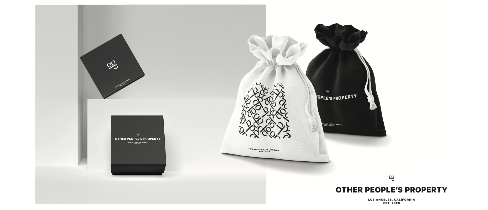
The 2x2 grid structure is important for the conceptual and modular aspects of this logo. The grid represents an aerial blueprint of how a city is laid out and since this brand ties in with urban & streetwear fashion, it only makes sense that this is where the logo grows it’s roots. In addition to the concept, this modular design allows for an all-over-print pattern that can be used for packaging, apparel, or even tissue paper.
The primary monogram was rendered through a CAD system onto a ring signet for the companies first product.
Small jewelry boxes and sacks were designed.